introduction
Cloudlux addresses the need for a simplified travel planning solution by offering an intuitive platform for users to organize their trips seamlessly. This case study outlines the design process and iterations undertaken to create an effective travel planning tool.
background
In my role as a UX/UI Designer, Prototyper, and Researcher, I collaborated with a team of four over a 3-month period to develop Cloudlux. Utilizing tools such as Figma, Google Drive, and Axure, we aimed to streamline the vacation planning process.
design tenants
Our design approach emphasized a seamless user experience, clear navigation, optimal feature set, minimal clutter, and accessibility for users of all levels. These principles guided our decisions throughout the project.
mid-fi prototypes
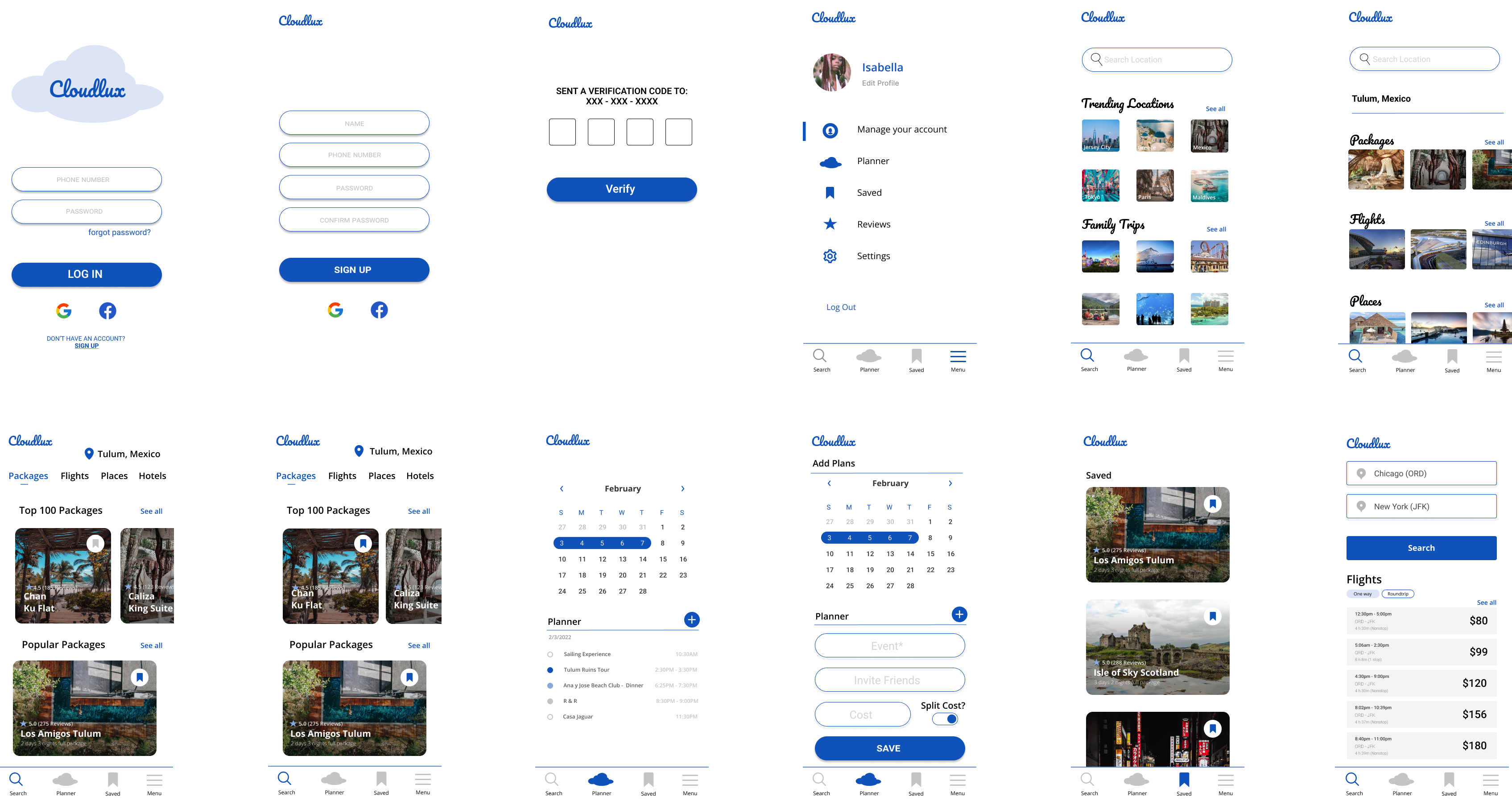
Initial usability tests on mobile and desktop versions revealed challenges, including confusion over tab labels and bookmarking functionality. We iterated on these prototypes to improve usability and clarity.
hi-fi prototype
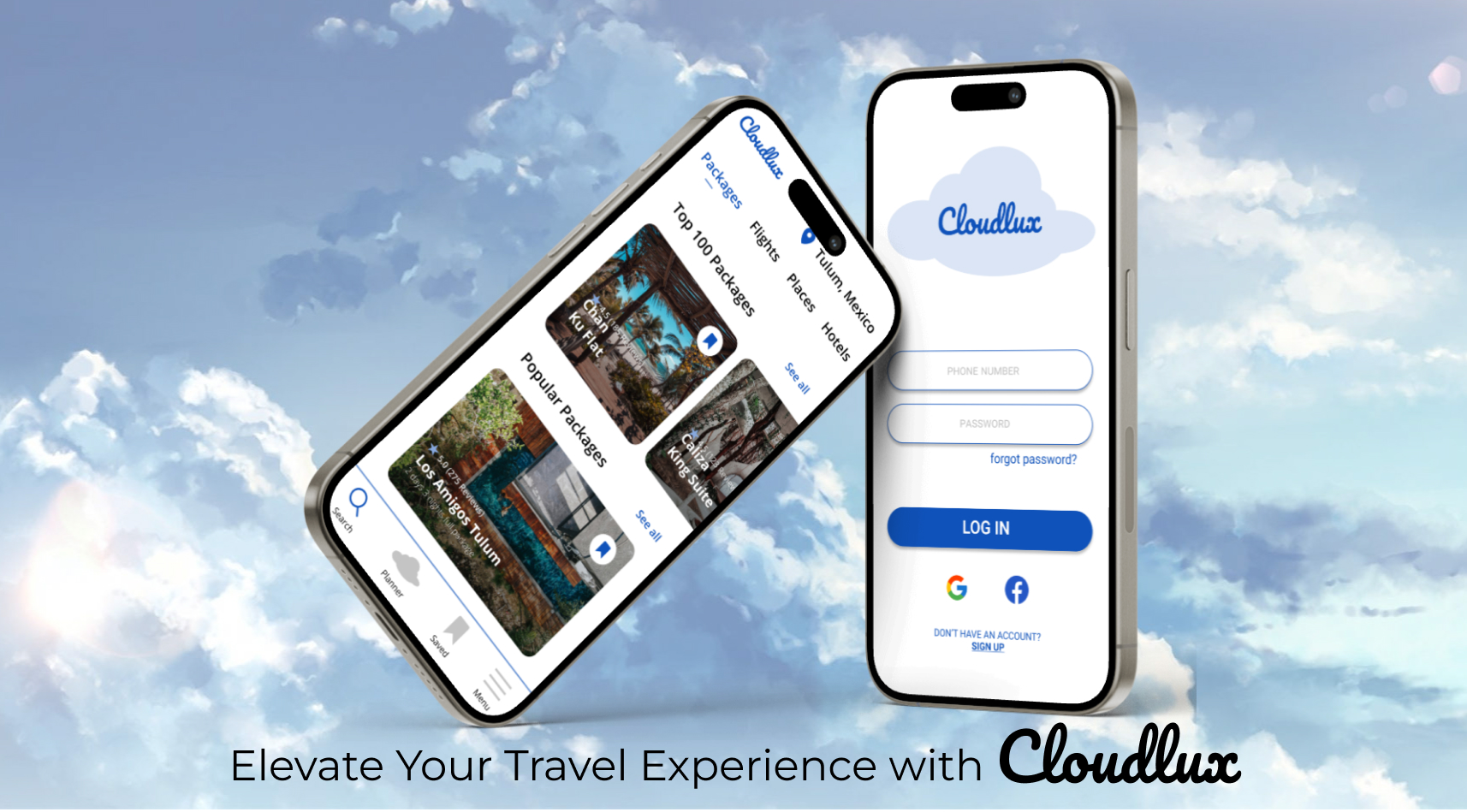
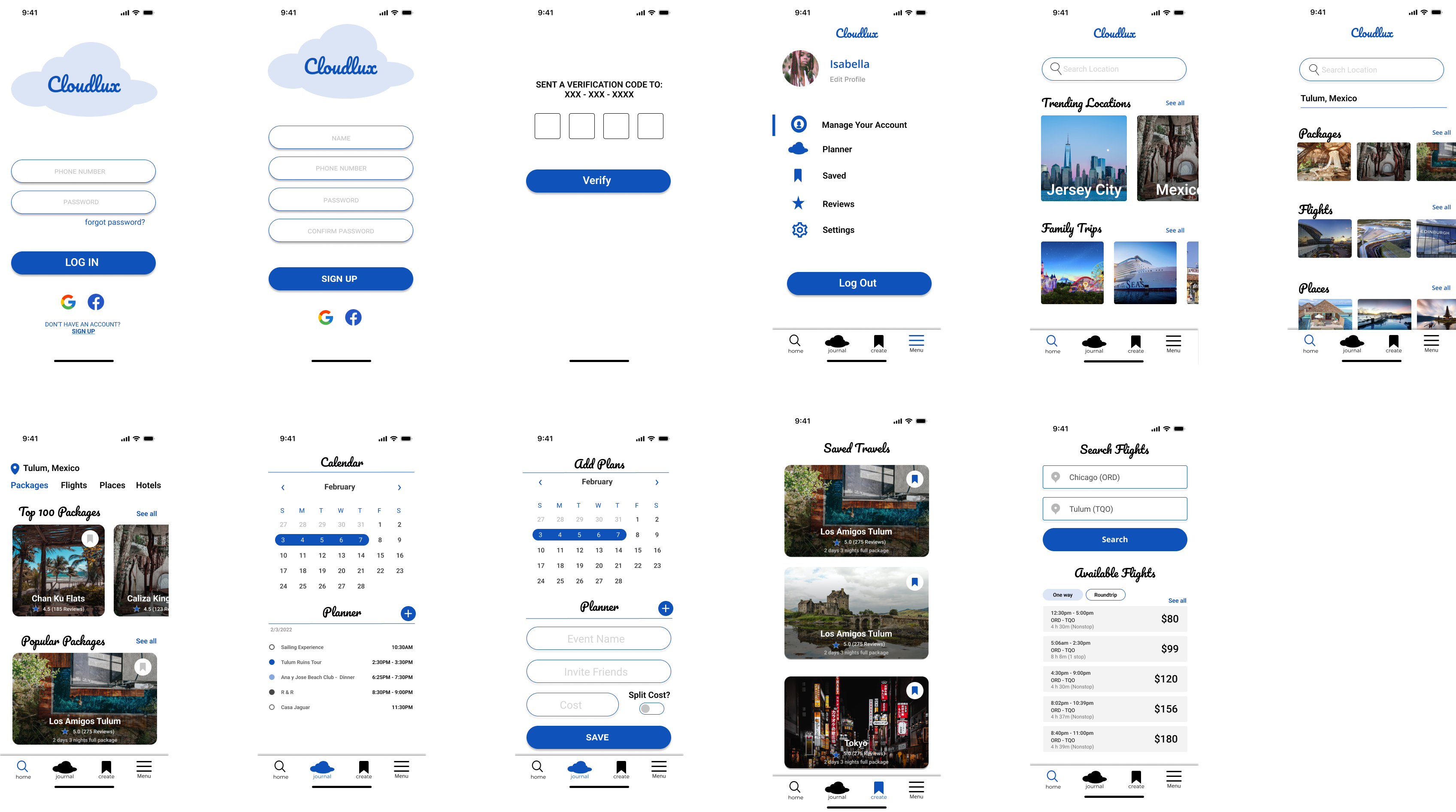
Refining the concept into Cloudlux, we created a comprehensive travel planning platform for mobile devices. This iterative process was driven by user-centered design principles and Apple's Human Interface Guideline.
conclusion
Cloudlux exemplifies the iterative design process and the importance of user feedback in creating a successful product. By prioritizing user needs and conducting thorough usability testing, we developed a robust travel planning solution that meets the diverse needs of travelers.